
Last week I was down in San Diego at the AdobeMax design conference. They were nice enough to tape my presentation and make it available for free on their site if you would like to check it out. CHECK IT OUT

MAYBE I SHOULD HAVE LEFT IT AS A PAINTING
I’ve been working on a painting called Trigger Happy for the last several weeks, and when it came time to print some new T shirts I thought the image was powerful enough to come off the canvas and onto some merchandise. I don’t strive to be a controversial artist, I don’t get off on being shocking. I also don’t want to beat people over the head with political messages. Nobody likes Bono. What I try to do is to combine powerful symbols in new ways. I want people to look at my work and develop their own meanings. For that reason I don’t put text with my images, or lengthy artist statements. We all have our own interpretations of art. The problem with that is that sometimes I catch flak for the meanings people come up with. Take this email exchange I had today.
Person: Gotta a say, I love your stuff… but was disturbed by the picture of t-shirt with gun and smily (sic) face. REALLY??? with all the violence today, your (sic) selling this?
Me: The real question is what does it mean? Is it a statement about violence or a celebration of violence? Perhaps a statement about the American psyche? Usually I don't beat people over the head with overt messages. Guns R Bad, is a little heavy handed for my taste. Look at it, think about it. Think about the title of the piece especially. Art is supposed to be challenging. But thanks for your input. I mean that.
Person: Thanks for the schooling and take me off of your email list
Me: I honestly meant thank you for your input. I like having conversations about art with people, but I see this didn't end well. Sorry I offended you I'll take you off the list.
So, that’s that. Artistic discourse at it's finest.
To me the interest in a piece like this lies in the tension between the saccharine sweetness of the smiley face and the implied violence of the gun. This is an experiment in meaning. Giving it an implicit message would be as easy as turning the smile upside down. Gun with frowny face = guns are bad. That simple maneuver relieves the dissonance between the two images, immediately making one single meaning easy to understand, and also serving to render the art trite and boring. There is no remaining room for interpretation, there is no larger message, there is no deeper meaning. Bono has spoken.
I honestly think that if I had left the image on a canvas this person might have been more inclined to think about it as art and give it a little more thought. Or maybe not. You can't please everyone I guess.
GOOGLE ARCADE PROCESS - Part 2
See Part 1 here
TYPOGRAPHY:
I wanted the type to have that retro game title feeling, line Zaxxon or Dig-Dug. It needed to be custom and done in a style that complimented the rest of the art.

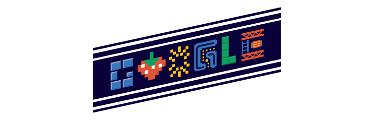
I figured doing the type would be cinch. Google is notoriously lax about their logo, right? Just look at all the Google Doodles that beat the crap out of their brand. I started developing a bunch of custom type treatments that I thought looked like retro games. For instance these two.

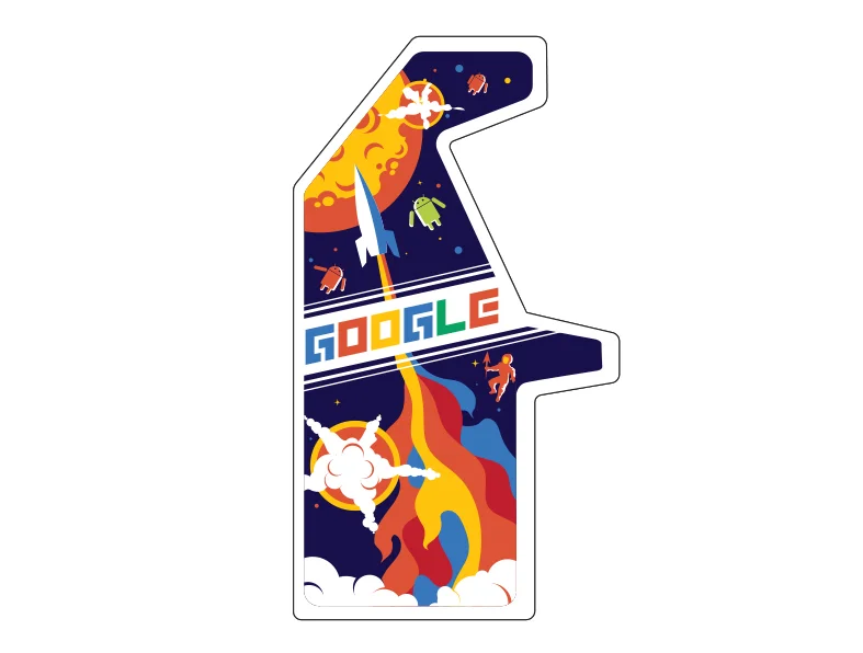
It turns out Google isn't lax about their brand at all. Re-typesetting their name in any other typeface is strictly verbotten. No matter what I tried it was rejected by the brand police. However, it turns out you can replace letters with images. So in the end I replaced all the letters with images. It wasn't the game title I was originally looking to do, but it kept with the retro gaming look a whole lot better than the actual Google logo which wouldn't have matched the rest of the art.
THE REAL TYPOGRAPHIC PROBLEM:
Google created these machines in order to give them away as awards. Instead of trophies or plaques, companies that created award winning online advertising would get one of these in their lobby. Pretty cool right? At the onset of the project they hadn't nailed down the name of the award yet. I was expecting something like The Webby, or the Addy awards. Turns out they came up with The Stuff You Click On Awards. Deliberately long titles are funny, and that's why they did it. However, typographically it was a problem. Games have short punchy names. Pac Man, Galaga, Battlefield. Not The Game Where You Drive Tanks Around A Maze And Shoot At Each Other. Fitting all of that verbiage on the side of the cabinet would take up most of the space, and generally the longer the name the less you can mess with the type because you need to maintain legibility.
I eventually worked out a solution similar to what worked for Star Wars The Empire Strikes Back. I used different levels of typography within the word mark itself. Additionally I placed the name of the award only on the kick plate on the front of the machine. On the sides we went with my Google type.

Google wanted their real logo to appear on white somewhere on the machine, so I relinquished the marquee to their branding. As with most cases of applied corporate branding it doesn't stylistically match with the rest of the graphics or fit the space particularly well. But I was already pushing my luck with the logo police, so I gave up that real estate in spite of the fact that graphically it breaks the retro game illusion.

Note, we did wind up having to update those marquees with the new logo after the machines were already finished.
EVERYTHING IS A REMIX
This is a great video that breaks down one view of how creativity actually happens.
GOTCHA! JOURNALISM
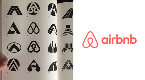
We live in an era when all the information that has ever existed is now at our fingertips. While this serves as a great resource for inspiration and a deep well for plagiarism, it also serves as an endless wellspring for annoying gotcha journalism. Recently Facebook has light up with posts about the Airbnb logo being found in an old logo book.
There are three ways this kind of thing happens:
1) It was a lift. It's very tempting when flipping though an old design book or the internet to spot your solution already fully formed and ready to go. Instead of going through the painful process of creating something from nothing, you can start the process 90% finished and simply brush up the colors and shape. This is a bad idea. Not only is it intellectually lazy, but you're gonna get caught. That said, people do it ALL THE TIME. And not just with logos. The hardest part of any design process is the concept and initial form development. Some designers and artists have made whole careers out of lifting stuff and most of us have tried it at least once. Much of the advertising you see consists entirely of reusing other people's ideas, songs, and images.

LEFT: My Edward Sharpe poster, 2012
RIGHT: Larnake Art Festival, 2015
2) It was "inspired by" the original. This is not the case here, as the two designs pretty much match. But every artist and designer knows exactly what I mean when I say that sometimes you see something and it inspires you to make something similar. That's how art works. Almost nothing is created in a vacuum. The goal here is to be inspired, but then create work that no longer looks like the original. Want to draw with squares like Piet Mondrian? Awesome, go nuts. But don't just make a grid of yellow, blue, and red. Do something else with the idea.

Picasso and the Cubists were inspired by African art.
LEFT: Pablo Picasso, 'Head of a Woman', 1907 (oil on canvas)
RIGHT: Dan tribal mask from West Africa

LEFT: My Ski Colorado poster, 2012
RIGHT: Johnny Cupcakes T shirt, 2015
I’m on the fence about this one. Obviously they didn’t just trace my design. On the other hand, the entire concept, layout, angles and textures are all remarkably similar to mine. Inspired by or ripped-off? My design was obviously inspired by vintage travel posters, which was what the client asked for.
3) It was simply a coincidence. There are no new shapes in the world. Let me be clear about that. All the shapes and colors already exist. Sometimes you can combine them in novel ways, but 99.99% of the time if you dig back far enough you can find pretty much the same thing somewhere else. For example:

TOP LEFT: Beats by Dre logo 2012
TOP RIGHT: A logo I made in 1998 for a now defunct tech company, nearly 15 years before the Dre logo
BOTTOM LEFT AND RIGHT: Old logos from the 1960's out of a logo book
In the end the issue is a little more complicated than simply pointing a finger and saying "You stole that!" Maybe they did, maybe they didn't. But the internet isn't known for it's sense of nuance, is it?
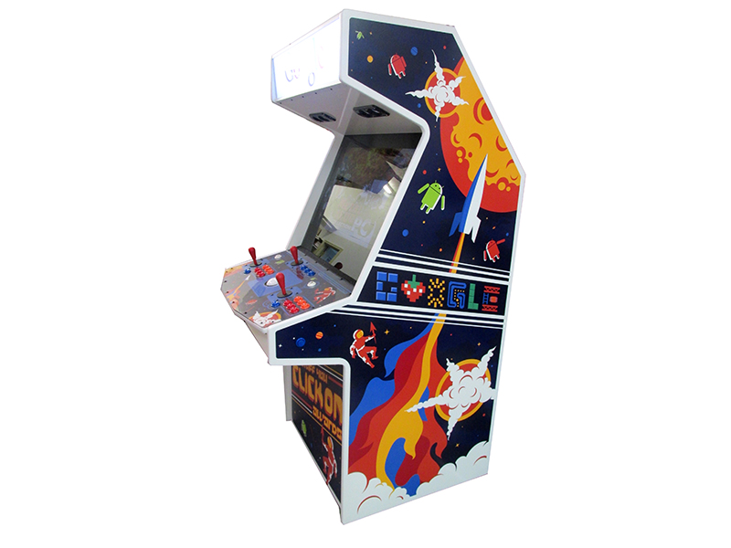
GOOGLE ARCADE PROCESS - Part 1
Periodically a dream job lands in my lap. In this case it was designing classic stand up arcade game cabinets for Google. How did I get the project? As usual, they found me, I didn't find them. They saw some of my previous work and figured I was the right guy for the job.
THE BRIEF:
As with many of my projects, the brief was pretty loose. "The design of the arcade cabinet should be bright fun and “Googley.” Design elements should convey the spirit of retro gaming with a modern flare. Avoid any actual game characters but think of all the classic themes. Love your style, this is a fairly open brief and should be a lot of fun." That was pretty much it.
MY PROCESS:
In order to not drive myself insane I gave myself some structure to work within. The best thinking usually comes from working within restrictions. Being a child of the 70's and 80's I distinctly remember the first Pac-Man game that was installed at the bowling alley by my house. Then over the next year or two several arcades popped up in the neighborhood. Video game cabinet art was always a dramatization of the game itself. In contrast to the simplistic 8 bit graphics of the games the cabinets were usually wildly elaborate renderings that resembled the back glass from pinball machines.
In light of this, my process started with this thought. If I was 10 years old and a new game called GOOGLE showed up in the arcade one morning, what would the premise of that game be? Would it be a shooter? A maze? A space battle? What would the internet look like as a game in the 80's? My first step was to come up with some simple game ideas. For instance maybe you're a guy who surfs in outer space on a giant arrow, maybe you're a glove character that runs around pressing buttons that open portals? Perhaps you fire rockets shaped like pointers at alien attackers? Once I knew what the games were then I could try to depict them.
My next step was to print out a bunch of blank cabinets and sketch on them. Quick and rough tests to see which ideas had merit. For instance here are the glove and the rocket ideas.

Once I had a couple of ideas I liked I built several rough comps in Illustrator to share with the client. Here are a couple of examples. On the left is a game where you blast shapes (that spell GOOGLE) out of the sky with pointer arrow rockets. On the right is the glove character that I mentioned above.

After the presentation I took the client's feedback and decided to take attributes from several of the favored designs and combine them into one illustration. The rocket came from one design, the explosions from another, and the shapes in the sky were replaced by Android aliens. This basic design formed the platform for the finished product.
Tune in next week for the dramatic conclusion of this project in Part 2

DAN STILES IN THE DENVER POST
Acclaimed poster artist Dan Stiles shows why his profession is stronger than ever in the new book "One Thing Leads to Another."
From grubby dorm rooms to art galleries and museums, concert posters have told the story of rock 'n' roll over its nearly 70-year existence.
But even as tastes and technology have changed, the best posters still do the same things they did in the late 1960s and early '70s heyday of Bill Graham's psychedelic shows at San Francisco's Fillmore West.
Read the whole article here
Many thanks to John Wenzel and The Denver Post
DAN STILES AT SF DESIGN WEEK
Adobe and the AIGA hosted a talk with me at SF Design Week. Here is a little interview on the Adobe Blog as well as a short promo video for the Adobe Working Late lecture series.
